

STEP 1: I begin by placing the anchor image for my poster that I was going to use. the first step was to add it on to Photoshop. I chose this picture that we took in the dark room before starting filming. The shot was also used in the film and shown through a flash. This shot is effective because of the red lighting which makes it stand out from the background.

STEP 2: After deciding and adding the image the next step was to add some effects to the image to make it look more effective. To get this, I used an image of a tree trunk and added on to photo shop. After adding the image, I reduced the opacity tool to decrease the opacity of the image and also the fill to blend it better with the actual image.

STEP 3: After editing the image to make it look more effective the next step was to add the basic things such as the slogan for the film and credits and the restrictions for the audience to be able to recognise the age limit for the film. I used smallest font for the credits in order to avoid it taking away the attention from the rest of the poster.
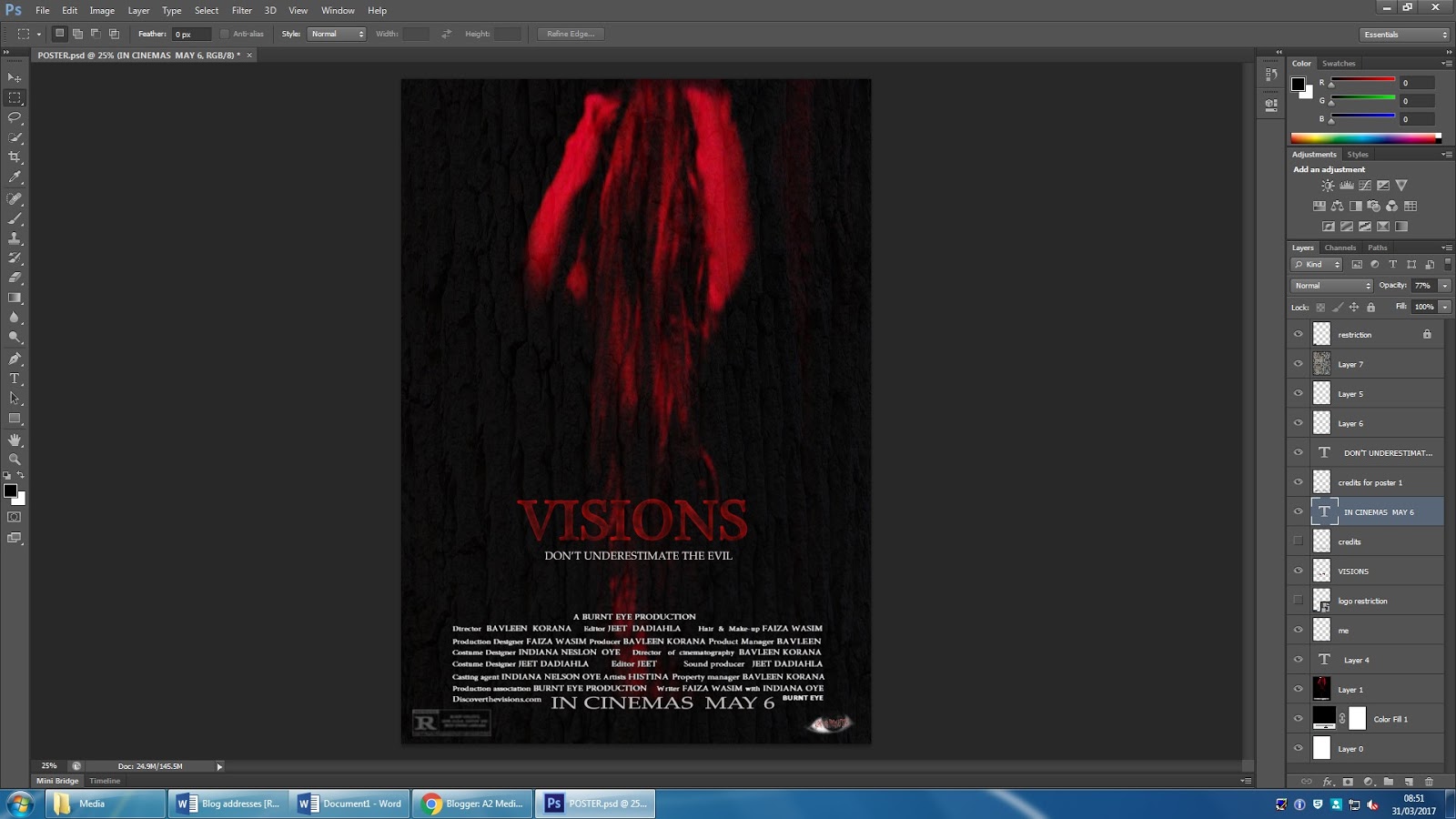
STEP 4: Finally, I added the date for the release of the film below the credits and used a slightly bigger font size for it to be visible enough but also not take away the attention from the main image. For the title I used the colour red which could have a polysemic meaning connoting danger and death. The colour red was crucial because in the teaser trailer the mother is seen sat next to the blood writing so the colour red throughout the promotion packaging would promote the film better. I also, used the burnt tool to burn the title a little bit to make it effective.
No comments:
Post a Comment